Gloria Mello's Blog.
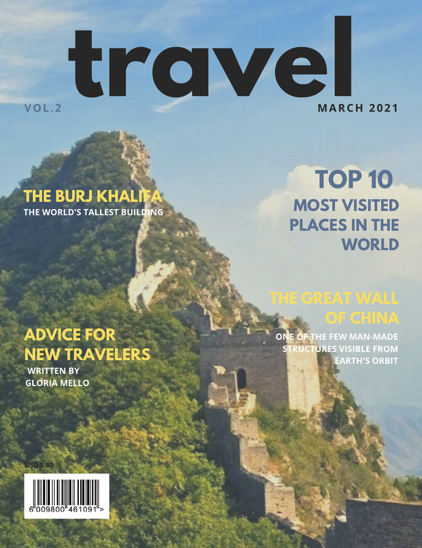 This is the 3rd time I've changed my magazine cover. I feel this time, my magazine cover looks realistic. I've made the cover more simplistic by removing several of the article titles from the cover. In the magazine draft 2, it looked overwhelming and unrealistic.
I made the words on the green mountain white and yellow to contrast the green and make it easier to read. I made the words that are in the sky dark blue to contrast the light blue. The title is black to stand out more too. I also but the filter "California" on the cover image to help the words pop out. Adding a brief description under "The Great Wall of China" and "The Burj Khalifa" will help attract readers. Who wouldn't be interested in the world's tallest building. It will be especially interesting to those who want to travel somewhere new. The cover photo was taken by Casper Farrell and was posted to picfair.com
0 Comments
Leave a Reply. |
 RSS Feed
